On Tuesday 11 February, we were thrilled to host a SkyLAB on the important mobile learning topic: the art of the carousel. We spent one hour discussing the subject and providing handy tips for optimizing the use of this format in digital training. Couldn’t make it? Don’t worry! Here are the main takeaways.
Why are carousels so useful in mobile learning?
Le carrousel est omniprésent dans l’univers digital, des réseaux sociaux aux plateformes de mCarousels are ubiquitous in the digital universe; on social media and mobile learning platforms. This fun and interactive format is the perfect tool for building learning content, while stimulating learner attention and engagement. But are you using it effectively?
During our SkyLAB, we explored the three main pillars of a successful carousel:
- Clear and snappy structure: Each card should convey a strong idea to avoid cognitive overload.
- Engaging design: A coherent layout and visual elements, such as icons, images and videos to help messages be assimilated.
- Effective storytelling: The card order and progression should naturally guide learners towards understanding and memorization.
12 recommendations for an effective course carousel
During our session, we shared 12 key recommendations for designing effective and engaging carousels. Here are details of the 12 recommendations for designing effective mobile learning carousels.
1. Limit the number of cards (10 maximum) to ensure smooth learning
Overly lengthy carousels can discourage learners and dilute the impact of the message. It’s best not to exceed 10 cards in order to remain concise and engaging. Remember to prioritize key information and to avoid cognitive overload.
2. Adapt the card size to mobile screens for optimal display
Carousels are designed for a mobile-first experience. It’s therefore essential that the card size is optimized for screens. Avoid overly long cards that require a lot of scrolling, as some learners will jump to the next card without having scrolled to the bottom of the previous one.
3. Use explicit titles on each card to contextualize information
A good title should summarise the card content in just a few words and give the learner a point of reference. It should be short, clear and to the point, enabling the topic in question to be grasped quickly. For example, a title such as, “3 tips for striking up a conversation with customers” is more effective than simply putting, “Striking up Conversation”.
4. Vary card formats to hold interest
Alternating between different cards helps to create a quick tempo and avoids monotony in the course.
5. Consider the pace and progression of the carousel by using structures like storytelling and chronology
A good carousel should smoothly guide learners from one idea to the next. You can structure your sequence using:
- Storytelling
- Chronology
- Learning progression
6. Harmonise the graphic design for a smoother user experience
Visual coherence is key for smooth interpretation. Ensure that:
- Colours are unform.
- Title size and alignment are seamless.
- Bullet points and other structuring elements are used sparingly.
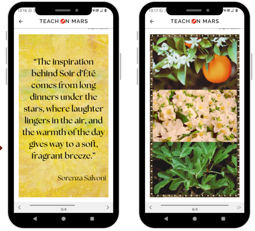
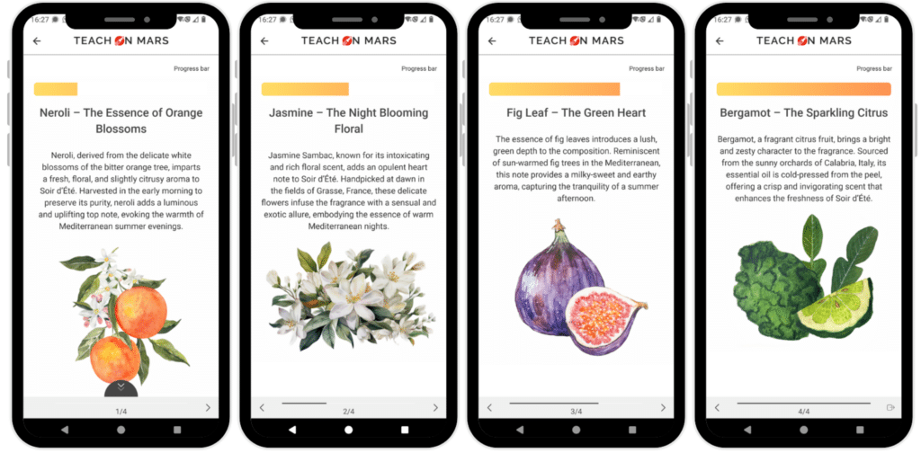
7. Add visuals such as banners and immersive images to illustrate your cards
Banners help to illustrate the top and bottom of your card. Recommended format: 768 x 50 px.
Similarly, images that occupy the entire screen can create a more immersive pathway. Recommended format: 768 x 1400 px.
8. Use visual references to guide learners
Guide learners using cursors to illustrate progression and to ‘reassure’ them about the length of the carousel.
9. Aim for a media mix by combining images, videos and sound to enhance the experience
Carousels are especially impactful when they include varied types of media:
- Short explanatory videos to illustrate precise points (e.g.: how to present a product)
- Audio extracts (e.g.: dialogue with customers)
- Infographics to summarise key stages and main points.
10. Use concrete examples and field feedback to infuse content with greater meaning
Anchoring in reality is an important lever for understanding and assimilation. Why not:
- Include testimonials from experts and users to illustrate best practices.
- Add field photos to contextualise the course (e.g. in-store or in the workshop, etc.)
11. Ajoutez une carte mémo en fin de parcours pour renforcer la rétention des informations
Les apprenants retiennent mieux quand on leur résume les points clés à la fin. Ajoutez une carte synthèse avec les 3 à 5 idées principales abordées.
12. Try out the latest trends (timelines, interviews, comics, top 5; etc.) to modernise your courses
Innovate by testing more entertaining and dynamic formats:
- Timeline: present a development over time (e.g.: project stages, brand history).
- Interview: showcase a testimonial in the form of questions and answers.
- Cartoon strip/photo-story: make content more narrative and immersive.
- Top 5: rank information in the form of a Top 5: Top 5 mistakes to avoid or recommendations, etc.).
And now, it’s over to you!
Did this SkyLAB inspire you to redesign your course carousels? Apply our recommendations and share your creations!
A big thank you to all the participants for their enthusiasm.
See you very soon for another SkyLAB! 🚀

Expert en didactique et passionné de langues et de technologies éducatives, Kevin se spécialise dans la formation aux adultes en contexte présentiel, hybride et à distance (e-learning). Fort d’un parcours de 10 ans en tant qu’enseignant-chercheur au sein de grandes universités canadiennes, il souhaite désormais mettre à profit son expertise pédagogique au service des entreprises afin de les accompagner dans la conception de parcours de formation favorisant la réussite et l’inclusion.