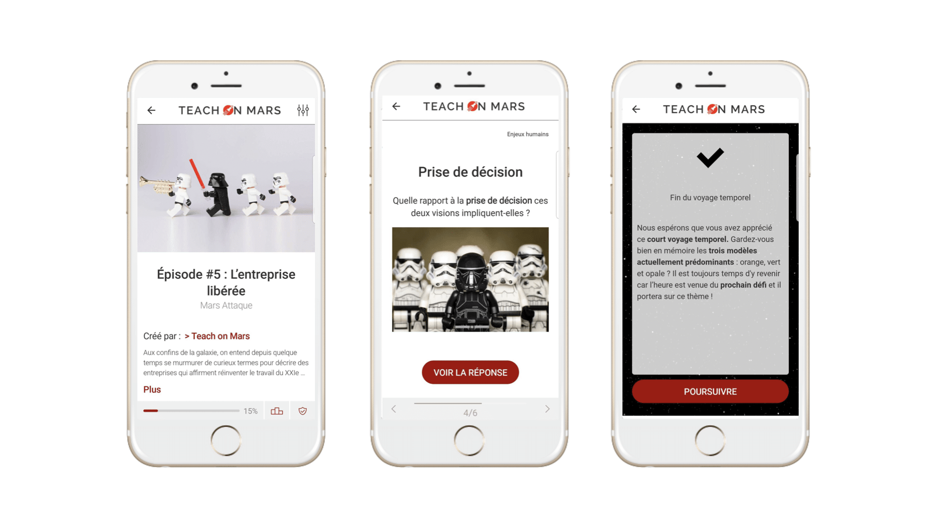
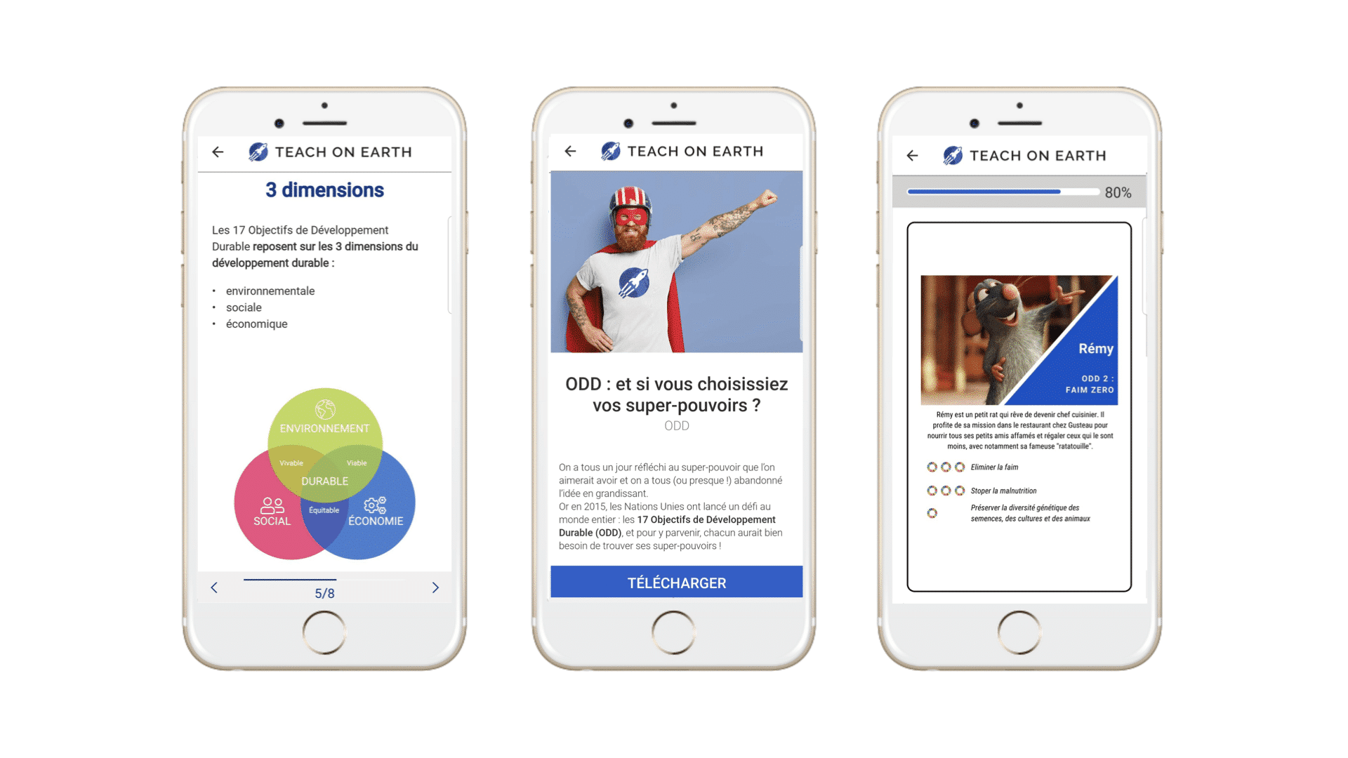
Passionate about learning, the Teach on Mars team works hard to select the most useful and inspiring mobile learning models for you. Today we present one of our favourites, to support you in your daily tasks.The model is based on the principle that in order to be efficient, mobile learning content must be:
- Succint
- Impactful
- Surprising
- Illustrated
When creating mobile learning content, you should therefore aim to make it concise, memorable, varied and visually appealing. Let’s look at these four criteria together.
Succinct: keep only what’s important!
Creating succinct content is often a difficult task in the world of learning. Designers are always seeking a balance between content that’s comprehensive but too dense, and content that’s concise but less informative.
In mobile learning, it’s important to segment your content to avoid cognitive overload. To achieve this, it’s best to keep the succinct criteria in mind as soon as you start structuring your content.
- Select your key ideas, and ask yourself what the objective of your training course is: to raise awareness? Or improve skills?
- Remove superfluous information as determined by your stated objective. Don’t be too specific if you’re trying to raise awareness, and don’t go over common knowledge if the goal is upskilling.
- Dying to give more detail? This could be the subject of another course. Don’t be tempted to cover other related subjects; if they’re really essential, make the connection to other content (another training course, an external link to learn more about it, additional resources in the end-of-course toolbox, etc.).
Some ideas:
- Before you even start designing the structure of the course, ask yourself what its objective and key messages are: “If my learner only had to remember three points, what would they be?”
- Targeting your messages makes you more succinct and whets your learner’s appetite and makes them curious.
Impactful: content that won’t go unnoticed!
To make your course unmissable, don’t forget to CO-MMU-NI-CATE!
- This could be on your communication banner (Wall Slider) with a superb visual and by activating a push notification.
- Or by communicating outside the app via the company network, newsletter or even in-house social media.
- Don’t forget the option of including a description at the gateway to your content, thus creating an enticing teaser for your course!
Some ideas:
- What’s the punchline of your content?
- Ask your future learners – what would they like to see in the course? What will it actually bring them? Use their words verbatim for the best possible impact.
Surprising, or the guaranteed “wow” effect!
By varying the type of activity or type of media in your courses, you retain your learner’s interest in the content you’re offering. By adapting content and creating interaction, you build loyalty!
Vary the activities in your courses, alternate between lesson activities and fun activities. But that’s not all! Within the same lesson activity, think about interspersing your content with questions (flash cards) or breathing spaces (transition cards) in order to appropriately pace these learning sequences.
Draw from the wide variety of includable media: text, image, video, audio and pdf files but also external links and web content! These will redefine the limits of your training course.
The Teach on Mars solution also allows you to integrate interactive videos and VR – the ultimate “wow” effect.

To learn more about interactive videos, click here.
Some ideas:
- Surprise learners by changing tack, introducing a narrator, having a known character speak with a quote and photo that’s off-topic (maybe not Nabilla Benattia on hair care training, but one could imagine the thoughts of an Olympic champion or iconic media figure).
Illustrated
Illustrated content offers a double advantage:
- It makes the learning experience more enjoyable by creating breathing spaces.
- It helps embed your key ideas through perceptual memory. It can even be used to reconstruct the learning pathway with visuals acting as reference points (for example: you remember that the definition was next to a specific image, that the model has 4 steps because the diagram was a 4-colour pyramid, etc.)
To optimise your content, use only high-quality, non-pixelated visuals. Choose consistent and relevant images!

Some ideas:
- Because you don’t always have a graphic designer to hand, make use of the inexhaustible image banks and in particular pictograms already in existence.
- From diagrams to photos and from sketches to pictograms, be sure to first define the graphic guidelines of your project so that you create a uniform feel for optimal results.
Like the SMART model which goes hand in hand with any goal worthy of the name, make the SISI model your best ally for mobile learning content!
Want to go further in analysing and optimising your content? Don’t hesitate to contact your project manager or account manager as our services catalogue is being constantly updated with the best practices in the field!
And to see this model in action, check out the winners of the 2020 Mobile Learning Awards. They’ve clearly understood all the benefits of the SISI model!

D’abord éditrice de manuels scolaires, professeure et coordinatrice pédagogique à l’Université, Julia a rejoint l’équipe Learning Experience chez Teach on Mars pour apporter ses compétences en pédagogie. La gamification et la différenciation pédagogique sont notamment ses chevaux de bataille.


