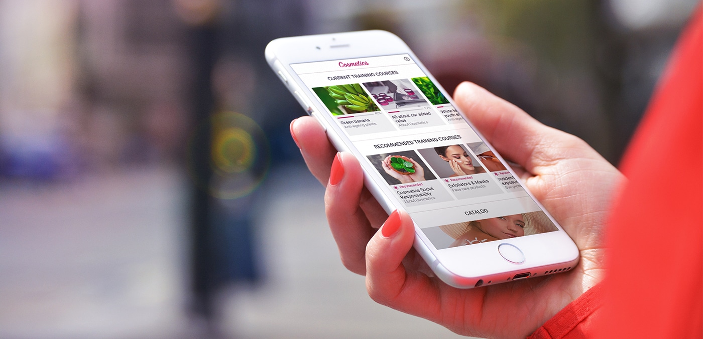
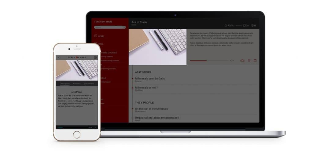
You are very soon going to be able to discover version 18.3 of our application, codenamed “Titan”.
For this major update of its Mobile Learning platform, Teach on Mars has mainly concentrated its efforts on overhauling the graphics and ergonomics of its product. And with the new design comes a change of image ratios! Read on for a brief overview of some of the very good reasons why we have made this change!
For greater simplicity!
Now you will no longer need to upload two different images per training course! Until now two files were needed, one for the thumbnail and another for the main image. From now, you will only be asked to provide a single training course image and the ratio will remain the same from one page to another, whether it is being viewed in the list of training courses in progress, in a Category page, or in the training course details page.
Why make things more complicated when they can be done simply?
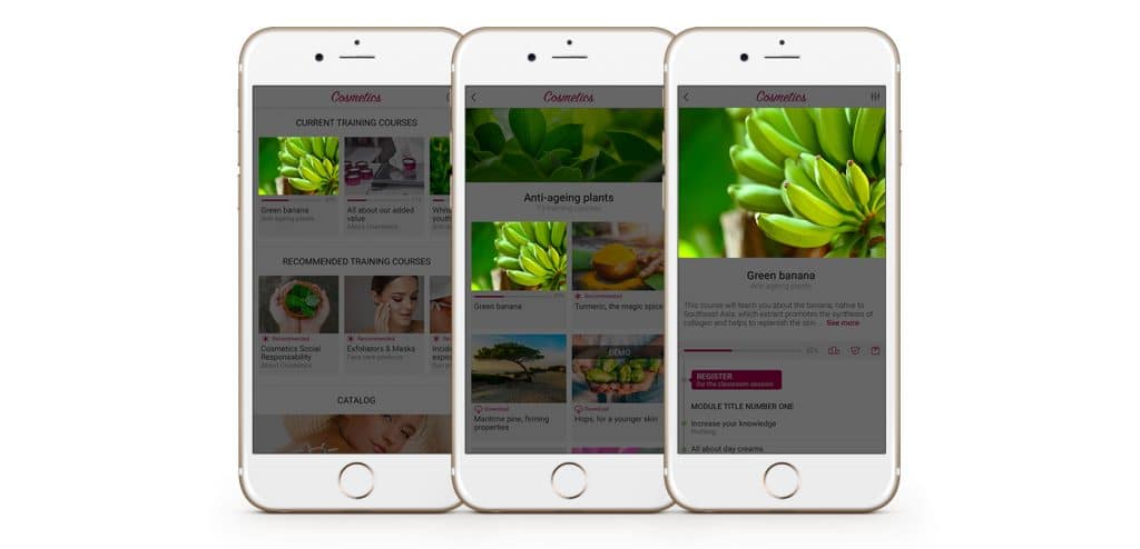
Image of a training course in 18.3 – Ratio 750 x 545 px
For a better user experience!
In version 18.1, as well as in all previous versions, the training course image and the category image were of relatively similar ratios… Impossible at first glance to tell the difference between them! The new approach adopted for 18.3 is to propose two ratios which can be clearly distinguished from each other so that the learner can identify them immediately. An easier way to make things clearer, for a more efficient learning experience!
To give the image pride of place!
To make the application more visual, the page headers now have an enhanced look with panoramic images. This second format is not only used for the new category images, but also appears in Article communications on the Wall, in the details page for an article, in the learner profile, and in the header of the APPS screen, which is the screen where the social networks are found.
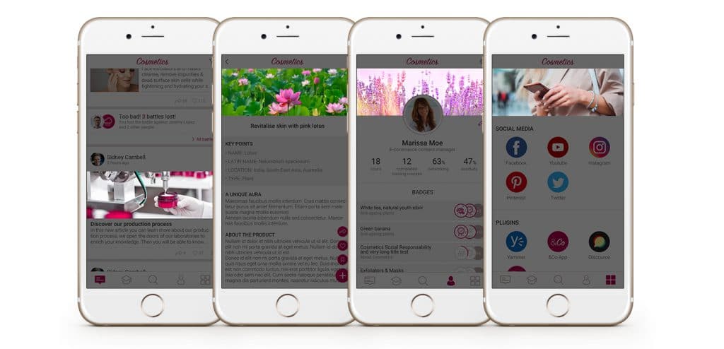
Panoramic images in 18.3 – Ratio 750 x 270 px
To keep your pleasures varied!
As will no doubt be clear to you by now, only two image ratios are needed in the new version of the application! Teach on Mars does however offer an additional 100% optional ratio! On the Wall, in addition to the panoramic format which is the default format for Article communications, you have the option of adding a second image, which will then be displayed in portrait format, aligned to the right or the left of the text.
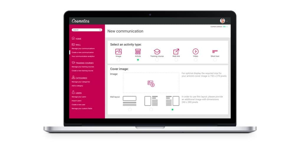
Choice of article display in the Mission Center
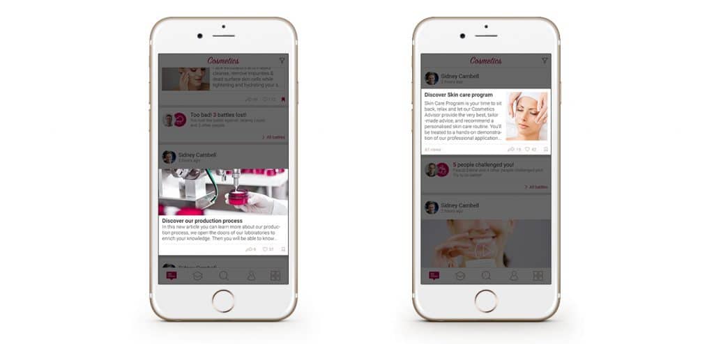
Display 1 (default) Display 3 (additional ratio)
For a more cohesive look!
Until now, sometimes part of the training course image was masked in the application, while this same image was displayed in its entirety in the WebApp. As the image was cropped differently on different devices, it was necessary to verify the final rendition in the app on a regular basis. With version 18.3, there are no more surprises! The image format requested corresponds exactly to the image format displayed, across all devices (smartphone, tablet, computer).
Image of a training course in 18.1
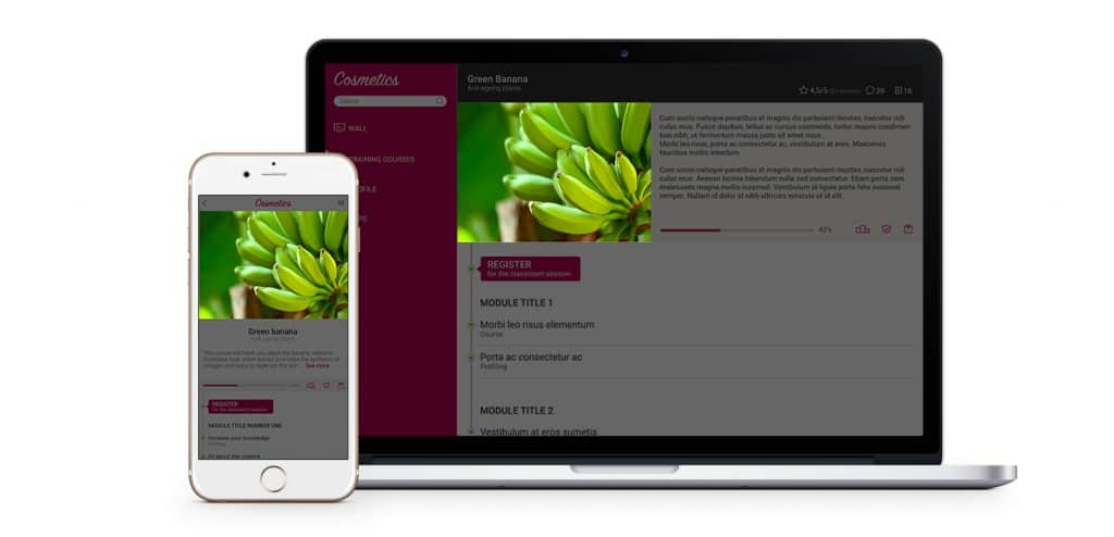
Image of a training course in 18.3

Cornélia a enfilé sa tenue de cosmonaute en 2017 en rejoignant Teach on Mars. Elle a d’abord dédié 5 années à accompagner les clients en tant que Customer Success Manager. Elle a ensuite pris une nouvelle trajectoire en pilotant les projets de communication et de marketing avec une ambition constante : explorer la galaxie pour renforcer la réputation de l’entreprise et soutenir son développement. Animée par une approche centrée sur le client, Cornélia contribue à renforcer les relations durables, la satisfaction des clients et à soutenir la croissance de l’entreprise.

