Already experienced the hint and tips of Lesson#1?
On how to decrypt our whimsical brain interpretation of what our blameless eyes get?
Fancy a wake-up call (Lesson#1)?
- Optical illusions mislead our senses; colours and shapes influence interpretation. Use these hocus-pocuses (yes, for dummies) to manage others’ brain vision analysis!
- Peripheral vision gets the glimpse of a situation. Hence pay attention to your outlying design, as this is what will give the overall picture to watchers!
- Patterns attract! Use it: grouping, white space, tables… And catch viewers’ eyes!
And there is more to come! Our brain play us sometimes of towers no?
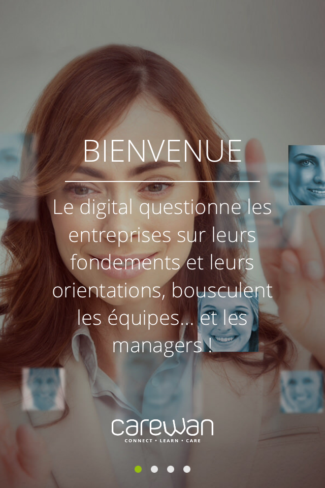
First, did you know that human faces, particularly the eyes, appeal? According to eye-catching researches, on a screen people first look and react to faces, they even follow the gaze direction! Do you notice the object in the illustration at the beginning of this article? 🙂
Teach on Mars illustration on face impact:
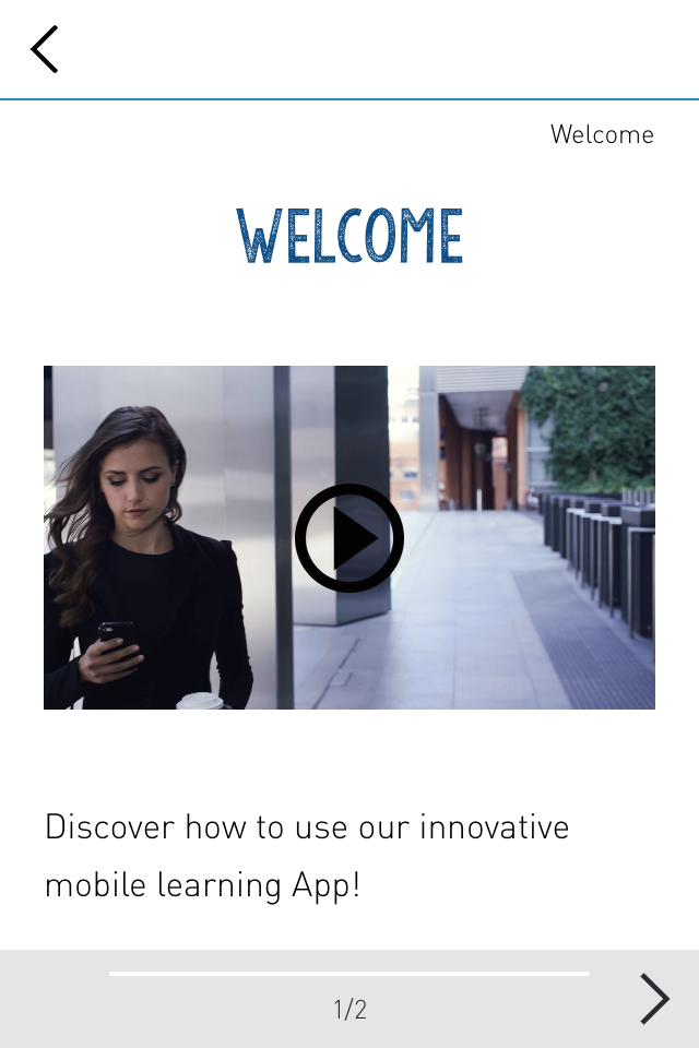
Another unconventional brain activity lays in its preference for the canonical perspective. Studies show that when volunteers are asked to draw an object from memory, they always represent it in its canonical perspective, this is how we best recognize and remember an object! Remember this useful information when designing your objects! That tip’s worth a cup of coffee!
Teach on Mars illustration on canonical perspective usage:
You may now have a valuable insight into your objects shape, but where are you going to map them on a screen, so as to bring them to light? Where do people look first on a computer or mobile screen? The few rules below may well enlighten you:
- People tend to move their eyes in their usual reading pattern (left to right, right to left, top to bottom), it is therefore more efficient to design a screen allowing readers to go trough a task or text in their standard reading pattern, avoiding to bounce back and loose sight of what a task or text is about.
- Readers look for critical information in the central area of a screen, rather than in the topmost corners. So avoid scrapping anything important by putting it at the edges!
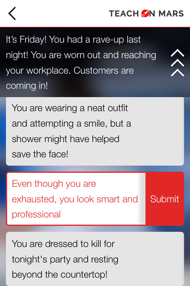
Teach on Mars illustration on screen information distribution:
Last but not least (don’t worry, just for lesson#2), think affordance!
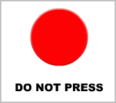
The perceived affordance is the match between what possible action(s) people perceive of an element and what they can actually do about it. The more perfect the matching, the more efficient the design! Make readers happy by offering them cues that fulfill their expectations! Apply it in your design by making sure that functional elements, like buttons, tabs, and form fields, have a strong and consistent edge design. Don’t you want to press that button?!
A Teach on Mars illustration on perceived affordance:
Our eyes coupled with our brain? What a team they’ve got! Wait for our next lesson and discover more useful weirdnesses!

Diplômée d’école de commerce et passionnée par les innovations du numérique, Noémie a enfilé son scaphandre et rejoint l’équipe Teach on Mars au poste de Content Manager. Elle intervient en marketing et événementiel tout en contribuant à Teach on Earth, une initiative sociale et environnementale.


