Dear Authors,
In lessons #1, #2 and #3, we study how oddly our busy brain sometimes analyses what we see. In lessons #4 and #5, we attempt to turn any bird-brain into an elephant memory that never forgets! In lesson #6, we celebrate emotions and how they can positively impact the experience with your mobile application!
What’s left? Are there more tips to enhance your mobile app content?
“All truly great thoughts are conceived while walking.” Friedrich Nietzsche, German philosopher said a long time ago.
“While walking”? Or did this visionary 19th-century man actually mean “while mobile learning” :-)! Well, in addition to enabling thinking while walking and (mobile) learning, how could you best shape your contents to stimulate learners’ thinking process and therefore improve your training efficiency?
Here are a few thoughtful advices.
First, I may have mentioned it in former paper already? I insist! Learners best process information in bite-sized chunks. The brain can only process small amount of information at a time. Have you heard of the concept of progressive disclosure? It consists of showing learners what they need when they need it. You then associate links to allow learners going levels further for more details.
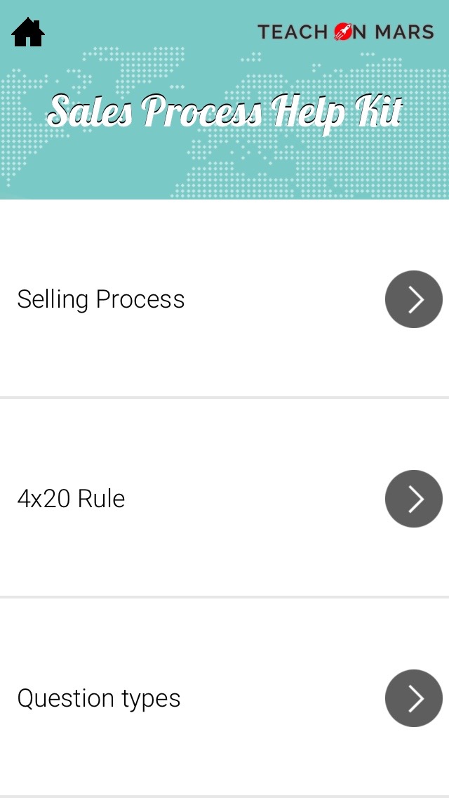
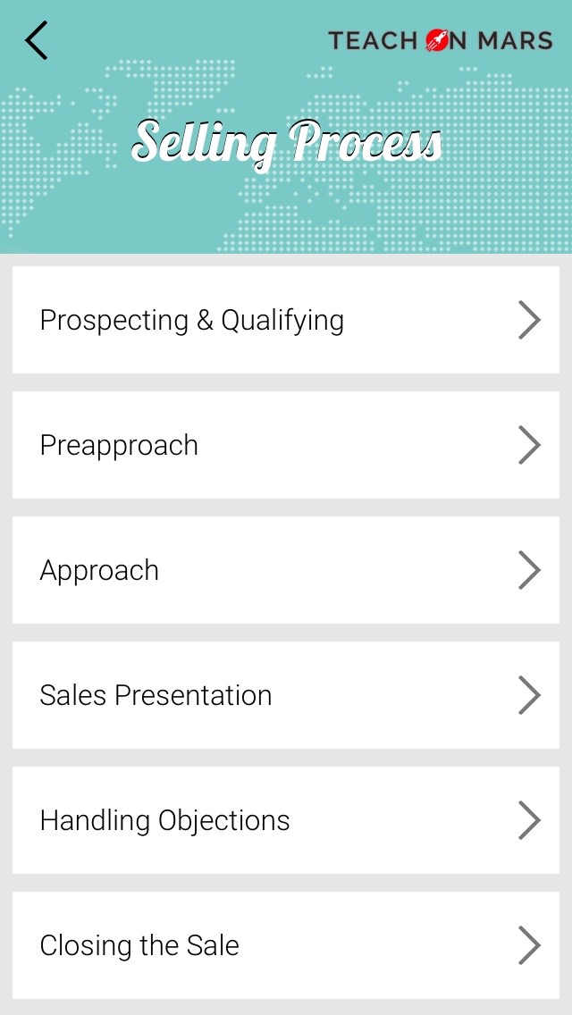
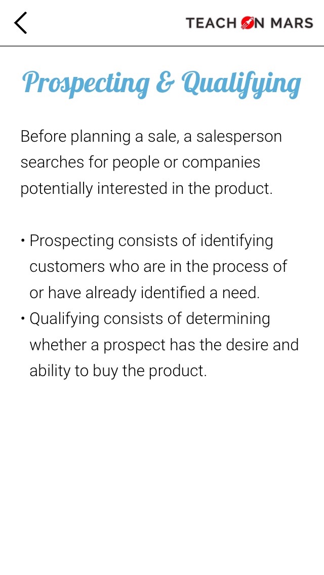
Teach on Mars illustration on chunking contents:
Have you heard of the “loads” in human understanding jargon? Loads refer to the amount of mental resources needed when completing an action. Some kinds of mental processing are more challenging than others! In design, loads are split into 3 types:
- A cognitive load is when you think about or remember something, do a mental calculation…
- A visual load refers to looking at something, finding something on a screen…
- A motor load is when you press a button, click, move a mouse…
Cognitive loads use more resources than visual loads, which in turn call for more resources than motor loads. When designing an interface, the fewer mental resources i.e. loads are needed, the easier the application is to use. An interface that primarily appeals to motor then visual loads will leave more resources to the user to focus on the purpose of the application, in our case, learning. It may be better to have more clicks if they give user a sense of logic.
Teach on Mars illustration on using motor and visual loads: Quiz Drapeaux du monde. The player clicks 3 times (motor loads) on buttons (visual loads) to start a new game. 3 clicks that make the player happy, because each step is logical and takes him where expected.
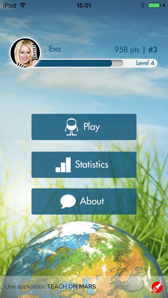 Click – Play |
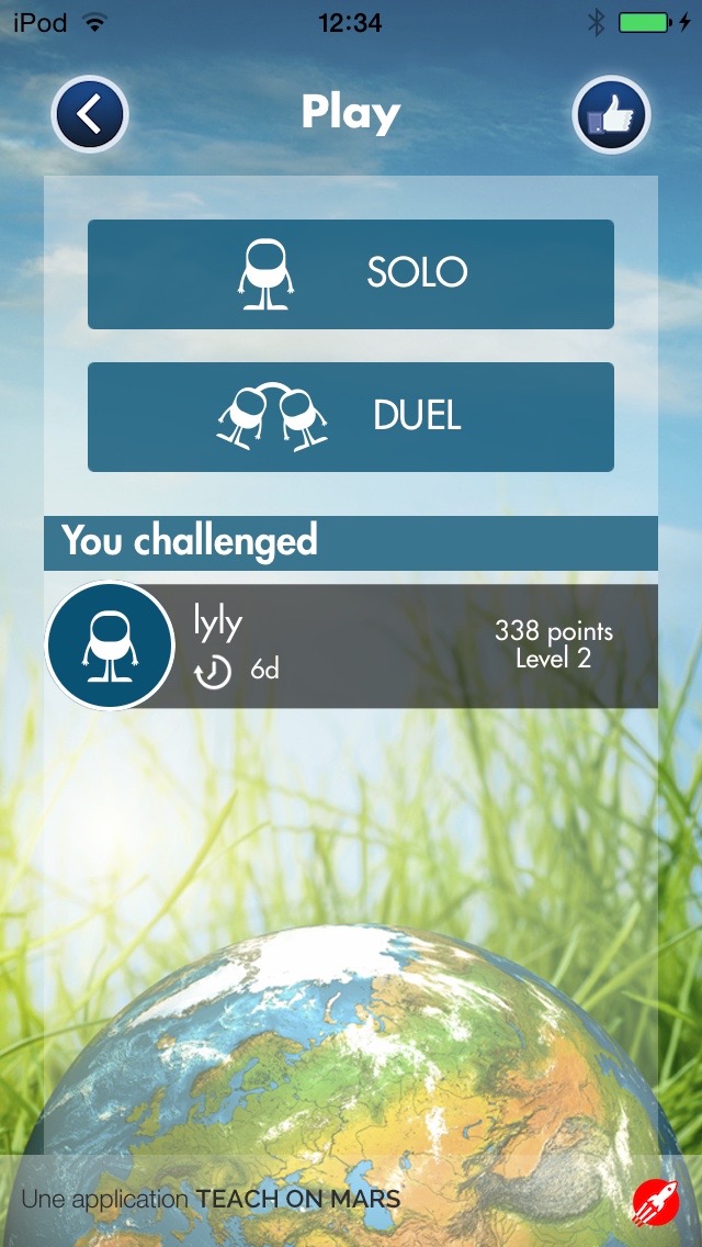 Click – Solo |
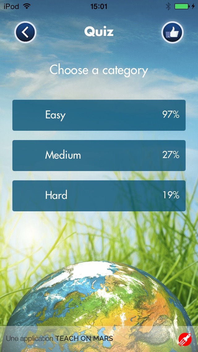 Click – Easy |
Let your mind wonder…. And wander! A wandering mind is said to be more creative, some researchers state. Whatever your degree of creativity, mind wandering is a very common phenomenon. During everyday activities, our mind would wander up to 30 percent of the time! Mind wandering is about doing one task and fading into thinking about something unrelated to that task. Failing to stop this natural behavior, yet we can inform learners about where they are so that if they wander, it’s easier for them to get back to the original location or go to the next.
Teach on Mars illustration on integrating mind wandering:
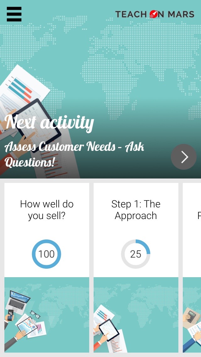 The next activity |
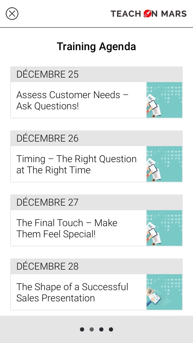 The agenda |
There are much more things to say about the way our mind processes information. Wait for lesson #8 to get another insight!
In the meanwhile, I let you think about it!

Diplômée d’école de commerce et passionnée par les innovations du numérique, Noémie a enfilé son scaphandre et rejoint l’équipe Teach on Mars au poste de Content Manager. Elle intervient en marketing et événementiel tout en contribuant à Teach on Earth, une initiative sociale et environnementale.


