Can you recall lessons #1 and #2 advices on eyesight brain analysis?
Fancy a wake-up call?
| Statement | Tips to improve your mobile learning app! |
| Lesson #1 | |
| Colors and shapes influence interpretation. | Mix colors and shapes to influence others’ brain vision analysis! |
| Peripheral vision gets the preview of a situation. | Pay attention to your outlying design, as this is what will give the overall picture to watchers! |
| Patterns attract. | Use patterns: grouping, white space, tables… to catch viewers’ eyes. |
| Lesson #2 | |
| Human faces, particularly the eyes, appeal. | Use faces on your background images, to catch users’ attention and interest! |
| We best recognize and remember an object in its canonical perspective. | Picture your items in a canonical perspective for users to best remember them. |
| Readers look for critical information in the central area of a screen. | Position your main contents at the screen centre, users believe that key info is central. |
| The more perfect the perceived affordance, the more efficient the design. | Make clear to users how your objects (buttons, links…) should be used! |
And there’s more!
In this last lesson on the vision topic, let’s decode together the power of colors over our visual interpretation.
First, according to chromostereopsis studies, blue and red, or red and green, are heavy together. Their combination is difficult and tiring to look at or read.
Teach on Mars illustration on green vs. red design:

Use green … and hardly red!
Second, Think about the color-blind population, 10% of your readers might miss the boat! There are various types of color blindness. Hence you should consider colors that work for everyone when designing color coding.
Teach on Mars illustration on the color blindness check:
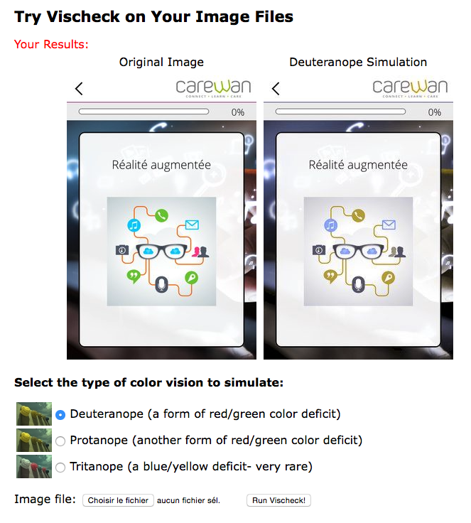
Use colors that work for everyone!
Third, colors carry a symbolic…. Different in different cultures! Red often means “in the red” or “financial trouble”. It might also mean “danger” or “stop”. In many occidental countries, white signifies purity and is used in weddings. However in other cultures white is used for death and funerals.
Check out the cultural color chart on the power of colors, provided by InformationIsBeautiful.net, and make sure to carry the expected message to your readers all over the world … and beyond :-)!
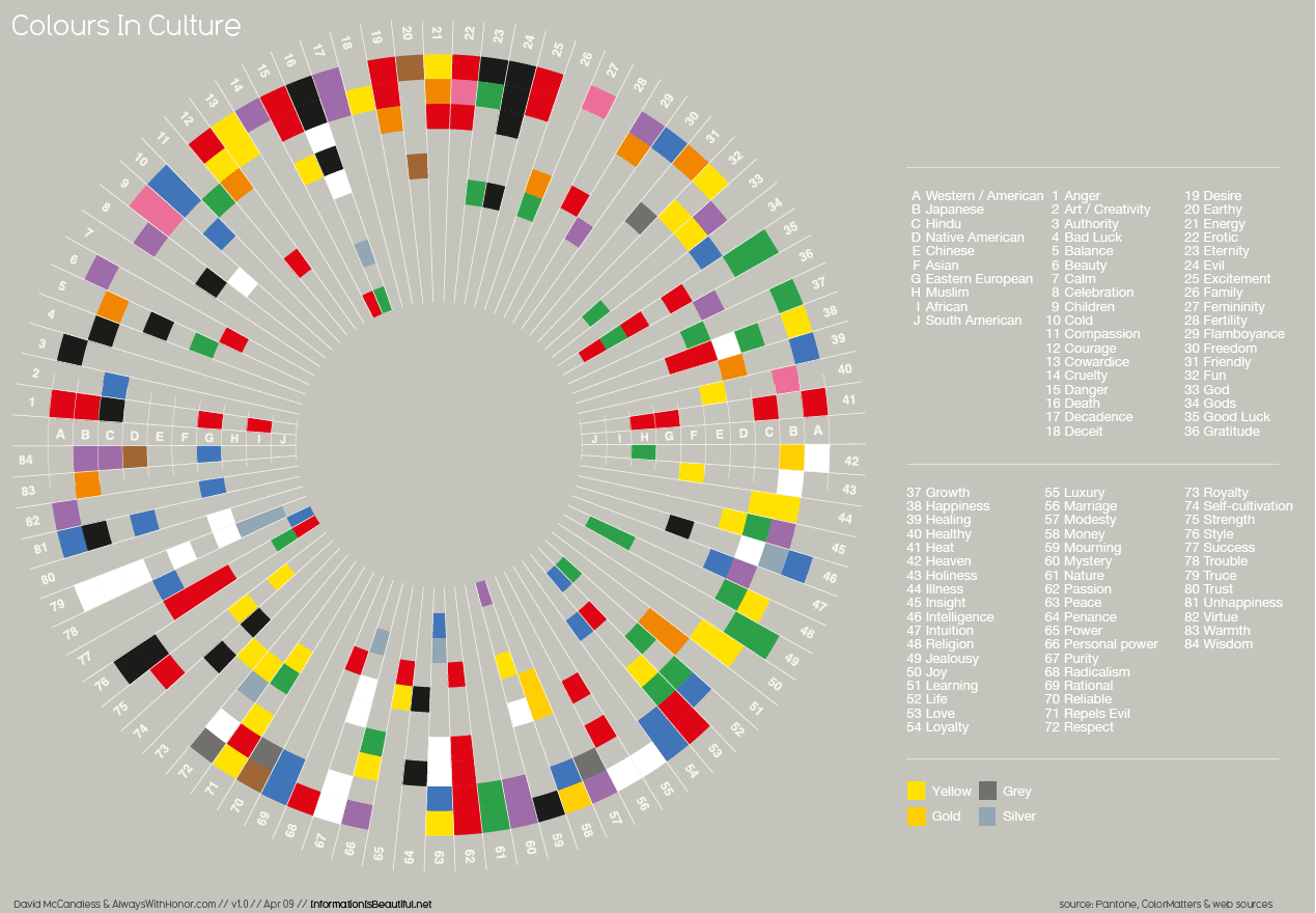
Use colors that work for every culture!

Diplômée d’école de commerce et passionnée par les innovations du numérique, Noémie a enfilé son scaphandre et rejoint l’équipe Teach on Mars au poste de Content Manager. Elle intervient en marketing et événementiel tout en contribuant à Teach on Earth, une initiative sociale et environnementale.